Yesterday, Andrew and I started working on a driveway for the undeveloped parcel of thorny, swampy woodland we bought during lockdown. We rented a chainsaw at an equipment rental place, where the guy asked if we had ever used one before. We had not. He showed us how to start it: open the choke, pull the string thing (technical term) vigorously a couple of times until you hear the motor almost catch. Then close the choke, one more vigorous pull and the engine catches. Easy.
We headed out to our woods a half-hour away, parked alongside the road, and determined a plan of attack. There’s an old stone wall that we wanted the driveway to run along, so we figured out the angle we needed to cut and tried to start the chainsaw. And failed. And failed. And failed. And then it smelled like gas we realized we had probably flooded the engine. And so there we were, sitting on the side of the road, Googling how to fix a flooded chainsaw engine. Then calling the rental place. Then finally driving back to the rental place, where they showed us how to get it going again and gave us updated instructions (pro tip: you shouldn’t open the choke at all if the saw is already warmed up).
When we got back to our property, the chainsaw started right up and I started cutting down saplings and hacking a path through the undergrowth. For every one minute of chopping, I had to stop the chainsaw, put it down, and rest, because it was so damn heavy. (It’s also freakin loud.) After we cut a narrow path about 30′ into the underbrush (of the ~1000′ we need to cut), the chain jumped the track. Some more Googling later, and we realized we didn’t have the hexwrenches we needed to get it back on.
This was all, of course, very frustrating and, in some ways, a huge waste of time. It certainly wasn’t how we were planning to spend the day. However, we learned a ton, so I’m counting it as not really a waste. We figured out a bunch of things that didn’t work and have a better idea of what to try next time (ear protection, bringing hexwrenches, rent a Brush Hog for the small stuff). My arms/shoulders/back are all noodles today, so we are going to be built by the end of this.
And machete-ing through the woods is pretty satisfying.
Every year, I go to GenCon: a gaming conference where tens of thousands of nerds descend on Indianapolis to try out new board games, RPGs, and other assorted nerdery. Indianapolis is no stranger to huge conferences, but GenCon stretches the city to its limits. GenCon buys thousands of hotel rooms throughout the city and then doles them out by lottery to the attendees. The hotels closest to the conference center sell out immediately, then it gradually filters out to the further away/more expensive options. A day after GenCon’s housing portal opens, every hotel room in Indianapolis is booked.
Putting up with/hacking around this annoying system for a decade inspired me to create a theory of resource allocation that, while I can’t imagine is original, I’ve never heard anyone else talk about.
When you control a finite resource that a lot of people want, there are three groups that you should allocate it to:
The deserving. These are the people you think will best use the resource: artists and superfans and young people who want to go so bad they will wait in line all night. These people might need subsidies (or at least reasonably-priced options) to be able to partake. However, they are expected to materially improve the quality of the conference/neighborhood/magnet school.
A random lottery. You think you know what will make a great conference/neighborhood/magnet school, but no one really knows the secret sauce. If you think of the previous group as a garden, this group is the wildflowers.
The rich. These people will subsidize the other groups/the event itself.
Basically all resource allocations can be broken down into some division between these three groups, and the interesting question is “what proportion should deserving vs. lucky vs. rich be?” They all have different strength and weaknesses. The rich might not add much of anything culturally. The deserving may stultify into an old guard that prevents innovation. The randos might be useless.
Right now, GenCon is 99.9% random lottery, with a handful of slots for rich people to get preferential access to housing. This means that they are missing out on a lot of the extra money they could be making from their more well-heeled patrons. They are also excluding a lot of passionate fans getting rooms in preference to someone who is mostly there to hang out in the hot tub.
Covid vaccines are another interesting case. Who should get a vaccine? The breakdown we’ve gone with is the deserving (front line workers, the elderly, etc.) then random. If vaccine rollout is blocked on money, what if providing a rich person with a shot a few weeks early could fund ten shots for front-line workers? A thousand? A million? If not, is there any number where you’d let someone you didn’t like get a shot early for the sake of humanity?
The problem with letting the rich pay their way in is that it feels so unfair. Lotteries feel fair. Letting in deserving people also feels fair (albeit subject to how deserving-ness is measured). In contrast, it’s infuriating when someone who already has enough gets more benefits. However, if you cut off the ways wealthy people can access a resource, they’re not going to just shrug and give up. They’ll just go outside the system: buy the most desirable hotel rooms a year in advance, send their kid to an expensive private school, or use their connections to get a vaccine. If we build ways to serve the wealthy in the system, the whole system can benefit from their resources.
Systems often default to a 0% allocation for the rich, because it feels fairer. However, I think it’s not usually the optimal choice, it’s just the easiest one to make a case for.
Altair is a beautiful graphing library for Python. I’ve been using it a lot recently, but it was a real struggle to get started with. Here’s the guide I wish I’d had.
First, you’re going to want to import numpy and pandas as well as altair. They’ll make working with data easier.
import altair as altimport numpy as np
import pandas as pd
To start with, we’ll generate a random dataframe and graph it using pandas. It’ll use matplotlib and look pretty ugly:
Instead, if you use altair:
Not much prettier, but it’s a start. There are several important things to note:
There are three separate parts to creating this graph:
Passing in the data you’re using (the alt.Chart call).
What kind of marks you want. There are dozens of options: dots, stacks, pies, maps, etc. Line is a nice simple one to start with.
What x and y should be. These should be the names of columns in your dataframe.
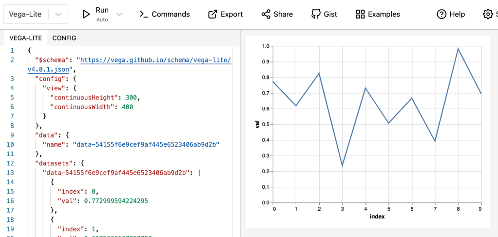
From point #3 above: Altair does not understand your indexes. You have to reset_index() on your dataframe before you pass it to Altair, otherwise you can’t access the index values. (The index becomes a column named “index” above.)
The API is designed to chain calls, each building up more graph configuration and returning a Chart object. The default behavior for showing a returned chart is displaying it.
Using this slightly more complicated configuration, you get a more attractive graph that you can do more with. However, as you try to do more with Altair, it just feels… not quite right. And it took me a while to figure out why.
Why Altair’s API feels weird
Why doesn’t Altair let you pass in a column (instead of a column name)? Why is typing and aggregation done in strings? Why is the API so weird in general?
The reason (I think) is that Altair is a thin wrapper around Vega, which is a JavaScript graphing library. Thus, if you take the code above and call to_json(), you can get the Vega config (a JSON object) for the graph:
The cool thing about Vega charts is that they are self-contained, so you can copy-paste that info into the online Vega chart editor and see it.
In general, I’ve found there are slightly confusing Python equivalents to everything you can do in Vega. But sometimes I’ve run into a feature that isn’t yet supported in Python and had to drop into JS.
Lipstick on the pig
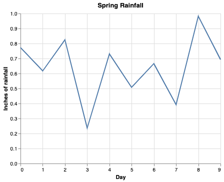
We can give everything on this chart a nice, human-readable name by passing a title to the constructor, x, and y fields:
alt.Chart(df.reset_index(), title='Spring Rainfall').mark_line().encode(
    x=alt.X('index', title='Day'),
    y=alt.Y('val', title='Inches of rainfall'),
)
You can also use custom colors and such, but the last graph I made someone asked why it was puke-colored, so that’s left as an exercise to the reader.
Poking things
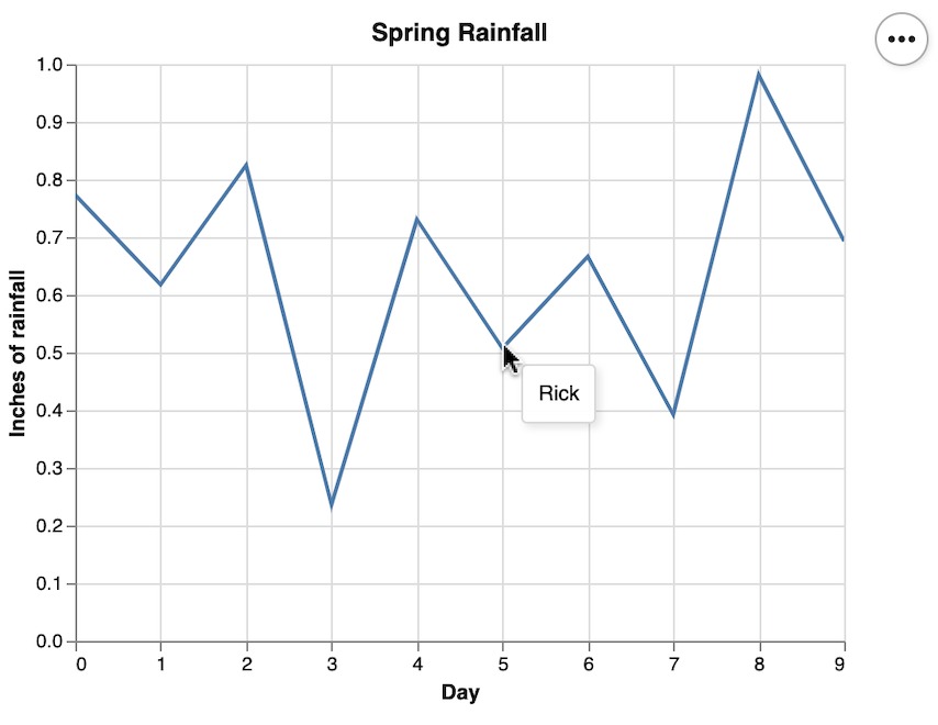
The real strength of Altair, I think, is how easy it is to make interactive graphs. Ready? Add .interactive().
alt.Chart(df.reset_index(), title='Spring Rainfall').mark_line().encode(
    x=alt.X('index', title='Day'),
    y=alt.Y('val', title='Inches of rainfall'),
).interactive()
Now your graph is zoomable and scrollable.
However, you might want to give more information. In this totally made up example, suppose we wanted to show who had collected each rainwater measurement. Let’s add that info to the dataframe, first:
At this point, I’ve fallen so far behind of where JS developers are that I don’t think I’ll ever be able to figure out what’s going on. However, Vercel is a portfolio company of GV’s, so I decided to give it a valiant effort.
Thus, I started at vercel.com. I went through their deploy flow for a Gatsby template, linked my GitHub account, and ended up with a static webpage. This created a new Gatsby repository on my GitHub account. Unfortunately, I also have no idea how to use Gatsby. However, I’ve also been meaning to learn Gatsby, so let’s dive in.
I cloned the repository and opened up in Visual Studio Code. Unfortunately, I’m not super familiar with VS Code, either, so then I had to look up how to add the damn folder to my workspace. (The weird thing about working at Google is that I have the best tools in the world at my disposal… just not the ones anyone else in the world uses.)
One quick StackOverflow search later, I’m suspiciously inspecting index.js in VS Code. This seems to be the business end of the app, but unfortunately I’m not familiar with React nor Helmet, both of which seem to be doing some lifting here.
Usually I’ve found the best way to learn a new thing is to mess around with it, so let’s start by changing the front end. I change the h1, commit, and push.
I head to the Vercel equivalent of the github page (e.g., my repo is github.com/kchodorow/gatsby, so my Vercel dashboard for it is https://vercel.com/kchodorow/gatsby. Nice. After a second, it updates and shows my new commit as the deployed version. Very nice. It also has been emailing me about its actions each step, which is a bit much for a personal project but would be nice in general.
Okay, time to get serious. How do I actually connect Vercel to a backend? Googling around for this, it looks like I’m going to be writing serverless functions. Guess what else I’m not familiar with? However, this looks interesting. Basically I can put node.js functions in files like api/foo.ts and this becomes a server request my app can make (/api/foo). I rename date.ts to hello.ts and push it out.
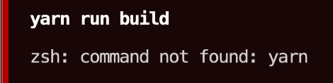
Vercel displays “Build failed.” Clicking on it, It gives me the build logs:
I take a look at index.js and realize that there’s some code that calls the backend function and loads it into a variable, which I completely neglected to change. Well, that’s good, just having {hello} work would be a bit too magic for my blood (and how would nested directories in /api be specified?). I update index.js and this time, cleverly, run yarn run build before pushing.
Sigh. Fine. I install yarn. Then I run yarn. It immediately fails because I needed to run npm install first. So I install dependencies, then I run yarn. Success! A push later, a successful build, and:
Verdict: Vercel is very cool. And I feel a little less behind the curve.
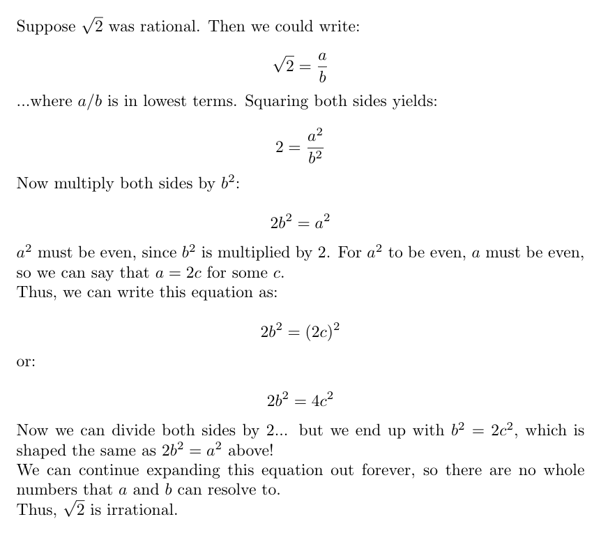
There is something delightful about LaTeX. However, the last time I bothered with it was in college, since I don’t have much call for PDFs in day-to-day life. I recently came across Overleaf, which is an online LaTeX editor. The nice part is that it live-renders your work and you can right-click->Save as an PNG. Thus, you can suddenly embed gorgeously formatted math anywhere. For example, here’s one of my favorite proofs, that the square root of two is not a rational number:
Proof by contradiction.
Source code:
\documentclass[varwidth=true, border=10pt]{standalone}
\usepackage[utf8]{inputenc}
\usepackage{amsmath}

\begin{document}

Suppose $\sqrt{2}$ was rational. Then we could write:

\[ \sqrt{2} = \frac{a}{b} \]

...where $a/b$ is in lowest terms. Squaring both sides yields:

\[ 2 = \frac{a^{2}}{b^{2}} \]

Now multiply both sides by $b^{2}$:

\[ 2b^{2} = a^{2} \]

$a^{2}$ must be even, since $b^{2}$ is multiplied by 2. For $a^{2}$ to be even, $a$ must be even, so we can say that $a = 2c$ for some $c$.

Thus, we can write this equation as:

\[ 2b^{2} = (2c)^{2} \]

or:

\[ 2b^{2} = 4c^{2} \]

Now we can divide both sides by 2... but we end up with $b^{2} = 2c^{2}$, which is shaped the same as $2b^{2} = a^{2}$ above!

We can continue expanding this equation out forever, so there are no whole numbers that $a$ and $b$ can resolve to.

Thus, $\sqrt{2}$ is irrational.

\end{document}
Sorry to keep posting financial stuff, but whatever, it’s my blog.
It’s interesting how the amount of investment risk that a human can put up with is very relevant to how much they have invested, and it isn’t linear. Let’s take the case of three investors, all of whom currently can invest $1k/month and need $1M in assets to live comfortably off of assets alone. While more is more, suppose these people aren’t particularly driven to keep accumulating wealth beyond their needs ($1M).
They start with:
Investor A: $1,000 in investments
Investor B: $1,000,000 in investments
Investor C: $1,000,000,000 in investments
To simplify things, we’ll say they keep 100% of their assets in stocks. Now, let’s say the market plunges by 90%: $100 invested in the market is now worth $10. What happens to each investor?
Investor A now has $100 in investments
Investor B now has $100,000 in investments
Investor C now has $100,000,000 in investments
I would argue that investors A & C are in a similar boat here, ironically. Investor A started out .1% of the way towards their goal and next month, they will be back to that. Not much has changed for them: the market set them back by one month.
Conversely, it doesn’t really matter what happens to Investor C’s portfolio. They’re doing fine regardless: greater than 100% of the money they need is still greater than 100%, even if it’s less than before.
Thus, Investor B is the only one in the danger zone. They were exactly at their investment goal, and now they’re only 1/10th of the way there! Theoretically, they’re now 7 years (900 months) away from $1M!
I was reading about “bond tents” as a way to defend against stock market crashes at retirement: you don’t want a market crash right when you retire, because then you’ll sell your stocks and have no way to replenish them to take advantage of the market recovery. (This is called sequence of returns risk, which ERN does a great job explaining.) Thus, it’s a good idea to increase your bond allocation going into your retirement so you don’t have to sell any stocks if there is a crash. Bond tents might be a good mechanism for investors like Investor B, too: if you’re near your goal you have more to lose than any other time.
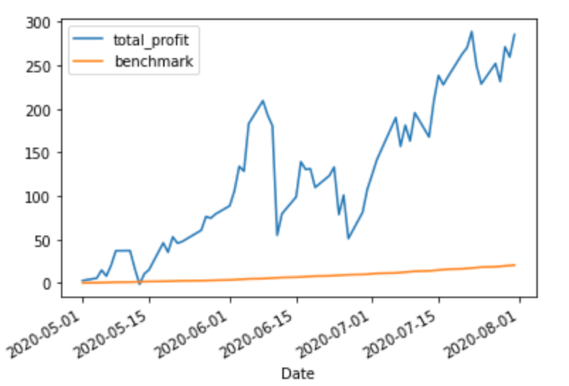
As Einstein (maybe) said, compounding interest is the eighth wonder of the world. In the previous posts in this series, we used a very linear benchmark: 4% off of the amount contributed forever. However, this is a weird way to benchmark results. Imagine you and friend (call him Baelish) are both investing and comparing results. You start off by investor $1k in August, 2020 and hope to have $1040 in one year. One year later, you have succeeded and have $1040. You tell your friend Peter Baelish about your investment and he puts $1040 in the market and sets a goal of making 4%: he’ll try to have $1081.60 by next year. However, if you stick with the model used in the previous post, your goal for the year will only be $1080 by 2022, leaving you a whole $1.60 poorer than your friend. (Arguably. We are talking about the benchmark, not the actual amount of money you’re earning. However, this whole series could probably be titled “It’s easy to mislead yourself that you’re doing better than you are,” so it’s fitting the theme)
So instead of a fixed amount, we want to continuous compound our benchmark. Because each value in the benchmark is determined based on the previous one, this is not Pandas-friendly. We’ll have to drop into “normal Python” to compute a more accurate benchmark.
Let’s stick with SPY, making once-a-month $1k contributions with the goal of a 4% annual return. The only difference is that we now want a 4% compounding annual return.
There are 253 trading days in a year and the formula for continuously compounding returns is:
Pt = P0 * ert
That is, the amount you have at time t (Pt) is the amount you have at the beginning of the period (P0), multiplied by the constant e raised to the rate (4%) times the amount of time. For example, if we contribute $1k and wait 1 year, we’ll want to have:
We get an extra $.81 cents off of the continuous compounding.
However, we want to be able to graph this benchmark by the day, so our t isn’t 1, it’s 1 year / 253 days = .00395. Plugging this in, each day we should have e.00016 more than the previous day. Using the code from previous posts, this gives us:
import math
benchmark = []
idx = 0
for day in df.index:
contribution = 0
if day in my_portfolio.index:
contribution = my_portfolio.loc[day].total_cost_basis
# The first time through, benchmark is [] (False), so it just adds
# todays_benchmark. Each subsequent iteration it uses the previous row.
if benchmark:
today = benchmark[-1] * math.exp(.004 * (1/253)) + contribution
else:
today = contribution
benchmark.append(today)
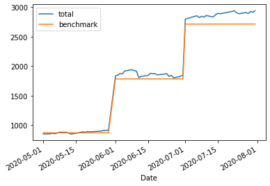
df.assign(benchmark=benchmark)[['total', 'benchmark']].plot()
This is, honestly, extremely similar to the original chart. After all, at the end of 1 year we only expect them to have diverged by ~80 cents per $1000! However, over time this number grows, which is clearer if we subtract our cost basis from the benchmark:
If you squint, you can still see the three distinct contributions. Pretty sure the wiggles are caused by weekends.
The nice thing about investing is that your money works “while you sleep” (depending on timezone). Tightening up the benchmark line by using a compounding benchmark lets us hold our money accountable when reviewing performance.
The lastposts have discussed portfolio performance with a very boring portfolio: one stock! Things get more interesting when there’s more than one stock to compare.
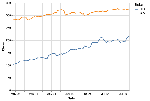
Let’s say we have a two stock portfolio now: SPY (as before) and DOCU (Docusign). We’ll combine the two tickers into one dataframe:
Now that things are getting more complicated, I’m going to switch to graphing with Altair, which I’ve found to be a more sophisticated (and prettier) alternative to matplotlib (which is what df.plot gives you).
import altair as alt
alt.Chart(df.reset_index()).mark_line().encode(
    x='Date',
    y='Close',
    color='ticker',
)
Similar, but a bit more sophisticated-looking.
Both stocks are doing well and it looks like DOCU is doing a bit better. So what would happen if we had invested $1000 in each of these stocks each month? We’ll create a random portfolio in a similar way to the first post, but notice that now we have to group by ticker symbol when we want ticker-specific info.
import numpy as np
# Get a random price on the first of the month _for each ticker_.
first_of_the_month = df[df.index.get_level_values(1).day == 1]
my_portfolio = (
    first_of_the_month
    .apply(lambda x: np.random.randint(x.Low, x.High), axis=1)
    .rename('share_cost')
    .to_frame()
    .assign(
         # Add a cost basis column to show $1k/month.
         cost_basis=1000,
         shares_purchased=lambda x: 1000/x.share_cost,
    )
    # Here's where the multiple tickers becomes interesting. We only want to
    # sum over rows for the same stock, not all rows.
    .assign(
        cost_basis=lambda x: x.groupby('ticker').cost_basis.cumsum(),
        total_shares=lambda x: x.groupby('ticker').shares_purchased.cumsum(),
    )
)
my_portfolio
This makes it nicely clear that, while SPY grew our investment by a couple hundred over this period, DOCU trounced it, nearly returning $2k on the same investment.
…or did it? After all, these gains aren’t realized. You don’t actually have $4917.68 in your wallet, you have shares that are worth that on the market. And to get that into your wallet, you need to pay taxes. So, a somewhat less exuberant way of looking at this is to include taxes in our calculations.
Everyone has a different tax situation, but since most people reading this are probably developers, let’s assume you’re in a pretty high tax bracket (40% income tax, 20% long-term cap gains). For the first year we hold this stock, profits will be taxed at 40% if we sell. After that, we could decrease the taxes to 20%, but we only have 3 months here, so let’s say we’re still in short-term gains territory.
If the gain is less than zero it’s a loss and could be used to cancel out gains, but I’m not handling that here (technically I don’t have to because there aren’t any loses, but I hear that sometimes the stock market goes down).
If we subtract taxes and our original investment and pretend we sold on the last day on the chart (July 31), we get:
DOCU still does amazing (although less so), SPY’s returns are starting to look fairly ho-hum. Although less dramatic, I like this way of looking at returns since it’s more reflective of what you actually end up with. And a good incentive to let stocks marinate for a year.
Last post went over building a very simple portfolio tracker to show a portfolio’s performance over time. However, it would be easy to trick myself: “My portfolio value is going up over time, I’m doing great!” But I’m also adding money to my portfolio over time, so that money shouldn’t “count” in terms of performance. I really want to be able to see the difference between having stashed the money in my mattress vs. put it into the market. We’ll figure out how to graph that in this post.
Last post, we ended with this chart:
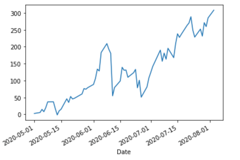
Cash invested and portfolio value
Let’s say that we don’t care about cash invested, only profits and losses. To see that, we can subtract out the cost basis and see what the raw performance looks like:
This gives a pretty nice breakdown of how I’m doing vs. keeping money in a mattress. However, how am I doing vs. my goals? Say my goal is to return at least 4%/year, but I can’t just draw a line from 0% January 1 to 4% December 31 because the money wasn’t invested in a lump sum. Money that’s been sitting there for a year should have yielded 4%, but money that was put in 1 month ago should yield 1/12 of that.
I think the easiest way to model this is to figure out how much our cost basis (cash_pos) should return per day, and then take a cumulative sum as the days pass to get the total expected return for any given day. (This isn’t perfectly accurate, but good enough for my purposes.)
Note that the benchmark seems to “curve” up as we add more money (although if you plot it on its own, you’ll see it’s linear segments of increasing slope as more money is invested).
We’re doing, uh, pretty good vs. the benchmark!
This is a nice way to handle benchmarking because it’ll work even if the portfolio isn’t quite such a “toy” example: if you’re investing irregular amounts at irregular intervals, this will still show you (roughly) the correct expected return over time.
I’ve actually never found a commercial product that does everything I want, so I figured I’d build one up in a series of blog posts. We’ll see how many I get through! 🧵👇
First, we’ll get SPY’s stock history with pandas_datareader.
This returns a dataframe that looks like this (as of this writing):
Basically Axe Capital over here.
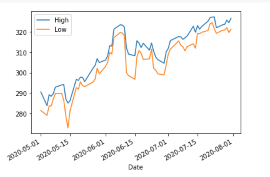
If we plot the High and Low columns (_ = df[['High', 'Low']].plot()), we get:
Now let’s throw in an actual portfolio. Let’s say I bought stock on the first of each month at some random point between the high and low:
import numpy as np
# Get the prices at the first day of each month.
first_of_the_month = df[df.index.day == 1]
my_portfolio = (
    first_of_the_month
    # Choose a random number between the day's high and low.
    .apply(lambda x: np.random.randint(x.Low, x.High), axis=1)
    .rename('cost_basis'))
my_portfolio
Let’s say that we have $1000 to invest each month (and our broker supports buying partial shares). So we can invest the following amounts each month:
my_portfolio = my_portfolio.assign(
    # Get the number of shares purchased this month.
    shares_purchased=1000/my_portfolio.cost_basis,
    # Get all shares I own so far.
    total_shares=lambda x: np.cumsum(x.shares_purchased),
)
my_portfolio
Finally, we want to add that back into the ticker info and plot it (let’s go with “Close” as the value for each day):
df = (
df
# Combine my_portfolio with the stock ticker.
.assign(shares_owned=my_portfolio.total_shares)
# Fill in the # of shares owned per day.
.fillna(method='ffill')
# Portfolio value = number of shares * price
.assign(total_shares=lambda x: x.shares_owned * x.Close)
)
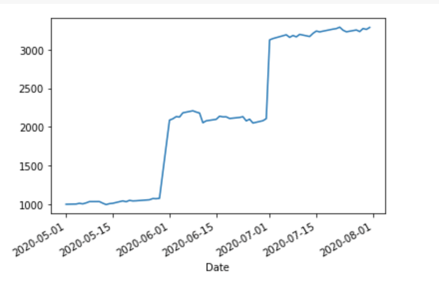
_ = df.total_value.plot()
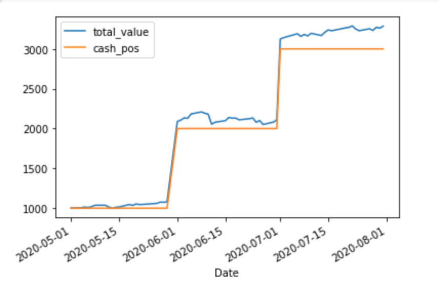
Looks a bit less impressive than the S&P 500 graph. Let’s compare it to keeping our money in cash:
We can see that our portfolio is doing better than an all-cash position almost immediately. However, there are a couple of things I’d like to add:
A real portfolio might have more than one stock. I want overall performance, plus broken out in different “sub-portfolios.”
At least for me, it’s not good enough to beat cash, I want to beat a benchmark (e.g., return at least 4%/year).
Let me know any other features you wish your broker supported in the comments and I may (or may not 😅) implement them.
On the other hand, this is a quote I’ve been thinking about a lot as I strategize about my portfolio:
We are all at a wonderful ball where the champagne sparkles in every glass and soft laughter falls upon the summer air. We know, by the rules, that at some moment, the Black Horseman will come shattering through the great terrace doors, wreaking vengeance and scattering the survivors. Those who leave early are saved, but the ball is so splendid no one wants to leave while there is still time, so that everyone keeps asking “What time is it? What time is it?” But none of the clocks have any hands.