
Last post went over building a very simple portfolio tracker to show a portfolio’s performance over time. However, it would be easy to trick myself: “My portfolio value is going up over time, I’m doing great!” But I’m also adding money to my portfolio over time, so that money shouldn’t “count” in terms of performance. I really want to be able to see the difference between having stashed the money in my mattress vs. put it into the market. We’ll figure out how to graph that in this post.
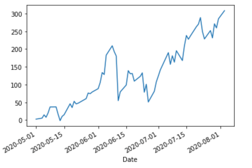
Last post, we ended with this chart:

Let’s say that we don’t care about cash invested, only profits and losses. To see that, we can subtract out the cost basis and see what the raw performance looks like:
df = df.assign(total_profit=df.total_value - df.cash_pos)
_ = df.total_profit.plot()
This gives a pretty nice breakdown of how I’m doing vs. keeping money in a mattress. However, how am I doing vs. my goals? Say my goal is to return at least 4%/year, but I can’t just draw a line from 0% January 1 to 4% December 31 because the money wasn’t invested in a lump sum. Money that’s been sitting there for a year should have yielded 4%, but money that was put in 1 month ago should yield 1/12 of that.
I think the easiest way to model this is to figure out how much our cost basis (cash_pos) should return per day, and then take a cumulative sum as the days pass to get the total expected return for any given day. (This isn’t perfectly accurate, but good enough for my purposes.)
benchmark_percent = .04  # 4%
trading_days_per_year = 253  # Market isn't open 365 days/year
daily_return = benchmark_percent / trading_days_per_year
df = df.assign(benchmark=np.cumsum(df.cash_pos * daily_return))
_ = df[['total_profit', 'benchmark']].plot()
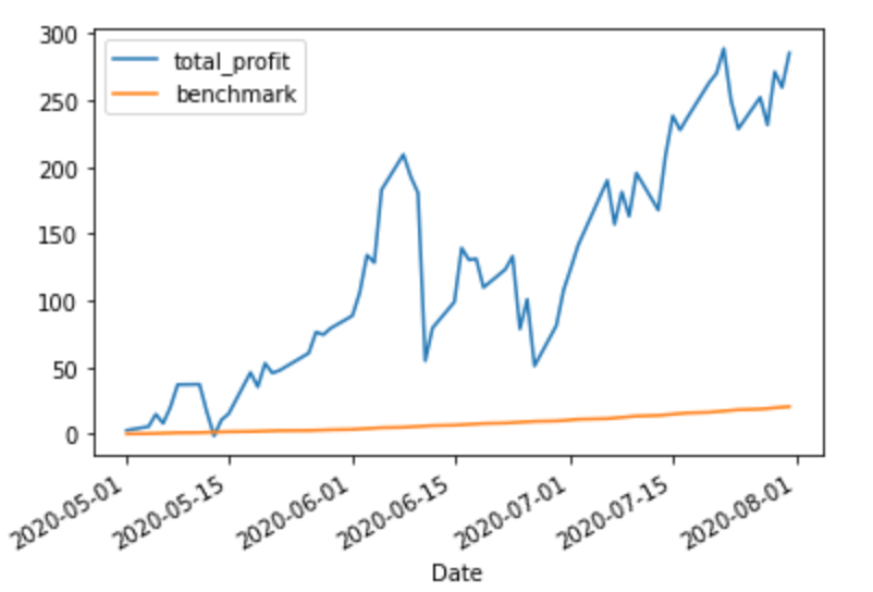
We’re doing, uh, pretty good vs. the benchmark!
This is a nice way to handle benchmarking because it’ll work even if the portfolio isn’t quite such a “toy” example: if you’re investing irregular amounts at irregular intervals, this will still show you (roughly) the correct expected return over time.

One thought on “Show me the money: tracking returns”