
The last posts have discussed portfolio performance with a very boring portfolio: one stock! Things get more interesting when there’s more than one stock to compare.
Let’s say we have a two stock portfolio now: SPY (as before) and DOCU (Docusign). We’ll combine the two tickers into one dataframe:
spy = pandas_datareader.data.DataReader('SPY', 'yahoo', start='2020-05-01', end='2020-07-31')
docu = pandas_datareader.data.DataReader('DOCU', 'yahoo', start='2020-05-01', end='2020-07-31')
df = (
    pd.concat([spy.assign(ticker='SPY'), docu.assign(ticker='DOCU')])
    .reset_index()
    .set_index(['ticker', 'Date'])
    .sort_index())
Now that things are getting more complicated, I’m going to switch to graphing with Altair, which I’ve found to be a more sophisticated (and prettier) alternative to matplotlib (which is what df.plot gives you).
import altair as alt
alt.Chart(df.reset_index()).mark_line().encode(
    x='Date',
    y='Close',
    color='ticker',
)
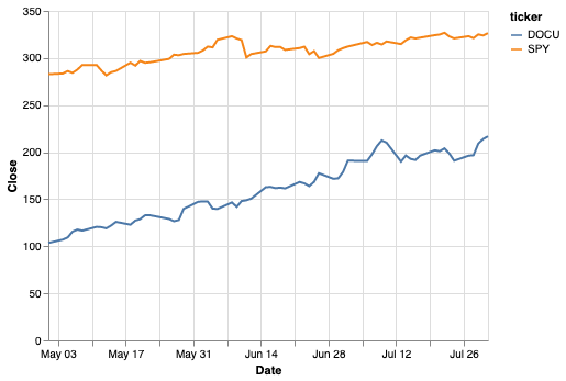
Both stocks are doing well and it looks like DOCU is doing a bit better. So what would happen if we had invested $1000 in each of these stocks each month? We’ll create a random portfolio in a similar way to the first post, but notice that now we have to group by ticker symbol when we want ticker-specific info.
import numpy as np
# Get a random price on the first of the month _for each ticker_.
first_of_the_month = df[df.index.get_level_values(1).day == 1]
my_portfolio = (
    first_of_the_month
    .apply(lambda x: np.random.randint(x.Low, x.High), axis=1)
    .rename('share_cost')
    .to_frame()
    .assign(
         # Add a cost basis column to show $1k/month.
         cost_basis=1000,
         shares_purchased=lambda x: 1000/x.share_cost,
    )
    # Here's where the multiple tickers becomes interesting. We only want to
    # sum over rows for the same stock, not all rows.
    .assign(
        cost_basis=lambda x: x.groupby('ticker').cost_basis.cumsum(),
        total_shares=lambda x: x.groupby('ticker').shares_purchased.cumsum(),
    )
)
my_portfolio

Add my portfolio back into the main dataframe:
df = (
    df
    .assign(
        shares_owned=my_portfolio.total_shares,
        cost_basis=my_portfolio.cost_basis,
    )
    .fillna(method='ffill')
    .assign(total_value=lambda x: x.shares_owned * x.Close)
)
alt.Chart(df.reset_index()).mark_line().encode(
    x='Date',
    y='total_value',
    color='ticker',
)

This makes it nicely clear that, while SPY grew our investment by a couple hundred over this period, DOCU trounced it, nearly returning $2k on the same investment.
…or did it? After all, these gains aren’t realized. You don’t actually have $4917.68 in your wallet, you have shares that are worth that on the market. And to get that into your wallet, you need to pay taxes. So, a somewhat less exuberant way of looking at this is to include taxes in our calculations.
Everyone has a different tax situation, but since most people reading this are probably developers, let’s assume you’re in a pretty high tax bracket (40% income tax, 20% long-term cap gains). For the first year we hold this stock, profits will be taxed at 40% if we sell. After that, we could decrease the taxes to 20%, but we only have 3 months here, so let’s say we’re still in short-term gains territory.
df = df.assign(
    # Capital gains
    gain=lambda x: x.total_value - x.cost_basis,
    taxes=lambda x: x.gain * .4,
    realizable_value=lambda x: x.total_value - x.taxes,
)
If the gain is less than zero it’s a loss and could be used to cancel out gains, but I’m not handling that here (technically I don’t have to because there aren’t any loses, but I hear that sometimes the stock market goes down).
If we subtract taxes and our original investment and pretend we sold on the last day on the chart (July 31), we get:
(df.realizable_value - df.cost_basis).groupby('ticker').last()
ticker
DOCU 1150.608974
SPY 166.252482
dtype: float64
DOCU still does amazing (although less so), SPY’s returns are starting to look fairly ho-hum. Although less dramatic, I like this way of looking at returns since it’s more reflective of what you actually end up with. And a good incentive to let stocks marinate for a year.
